In the Studio This Week – Abstracts and Dreams
In the studio this week, I ventured into the world of abstracts. I found the process freeing and frustrating. It’s difficult for me to paint without a model or reference photo. I also ventured into tapping into my dreams for creative inspiration. The jury’s still out on whether my dreams were worked for me or not.
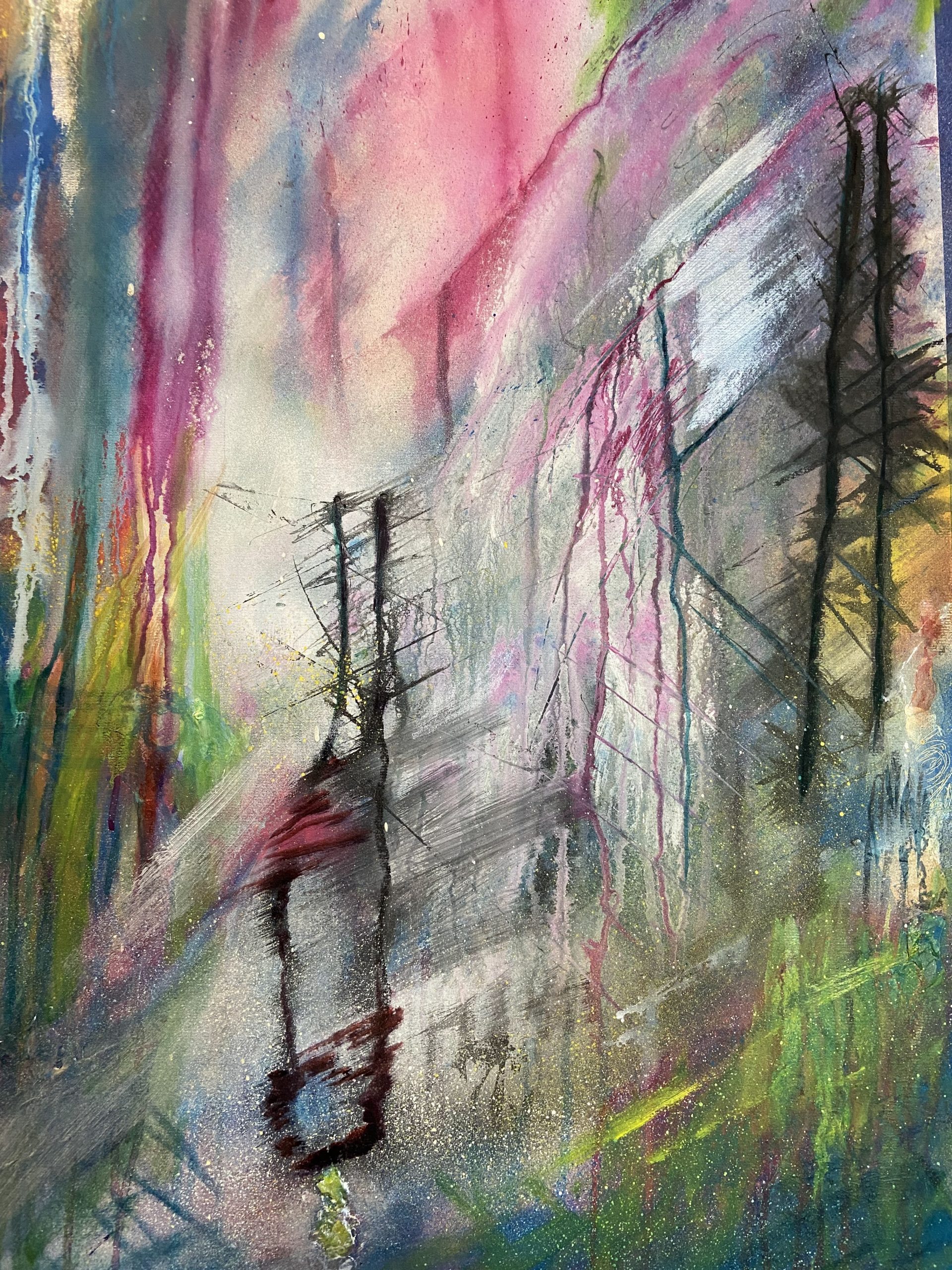
Abstract I
I started this on a large piece of watercolor paper – 22” x30” – mounted on a piece of hardboard. Even though I didn’t have a reference to work with, I chose a split complementary color scheme with the thought that it would provide unity to the painting.
I started with light washes of acrylic paint in shades of red (magenta) and shades of green. I then dripped acrylic ink in various places across the paper. Touches of spray paint were then applied. I started to see forms reminiscent of trees in a forest (or maybe utility poles).
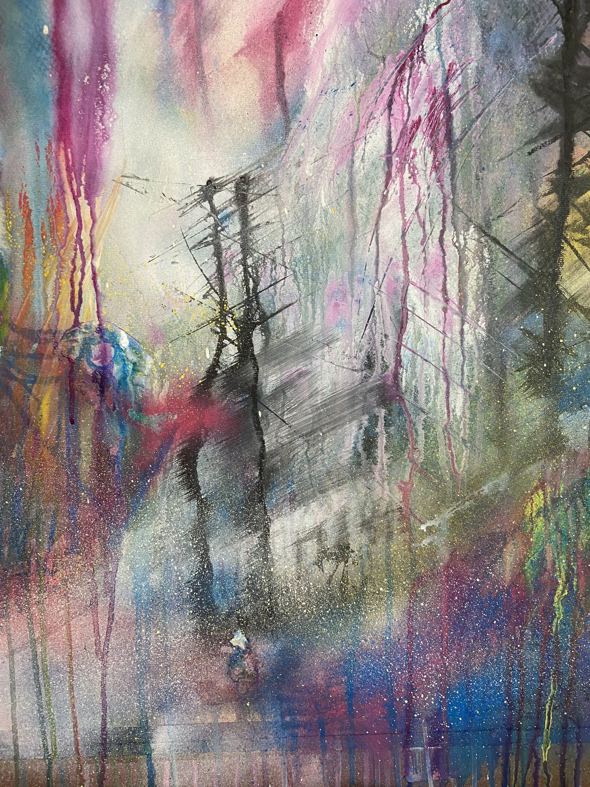
I then added some oil paint to provide some luminosity. I like the colors but don’t think it checks all the boxes as a successful abstract. What do you think?
Abstract II
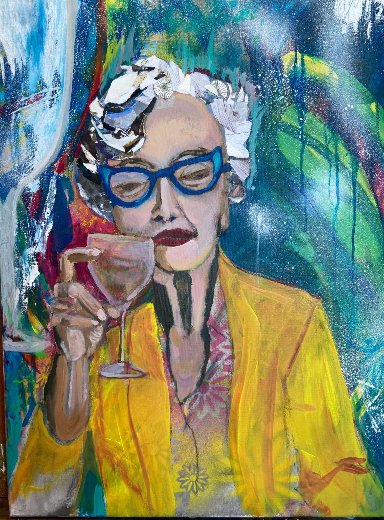
I chose to work smaller on this next abstract. I used many of the same techniques with washes and drips and spray paint. I also wanted to use some techniques that gave me trouble in previous lessons – collage and texture paste. I also wanted to use a more neutral color palette. I also included a note from a card sent to me. You can see it in the upper left corner.
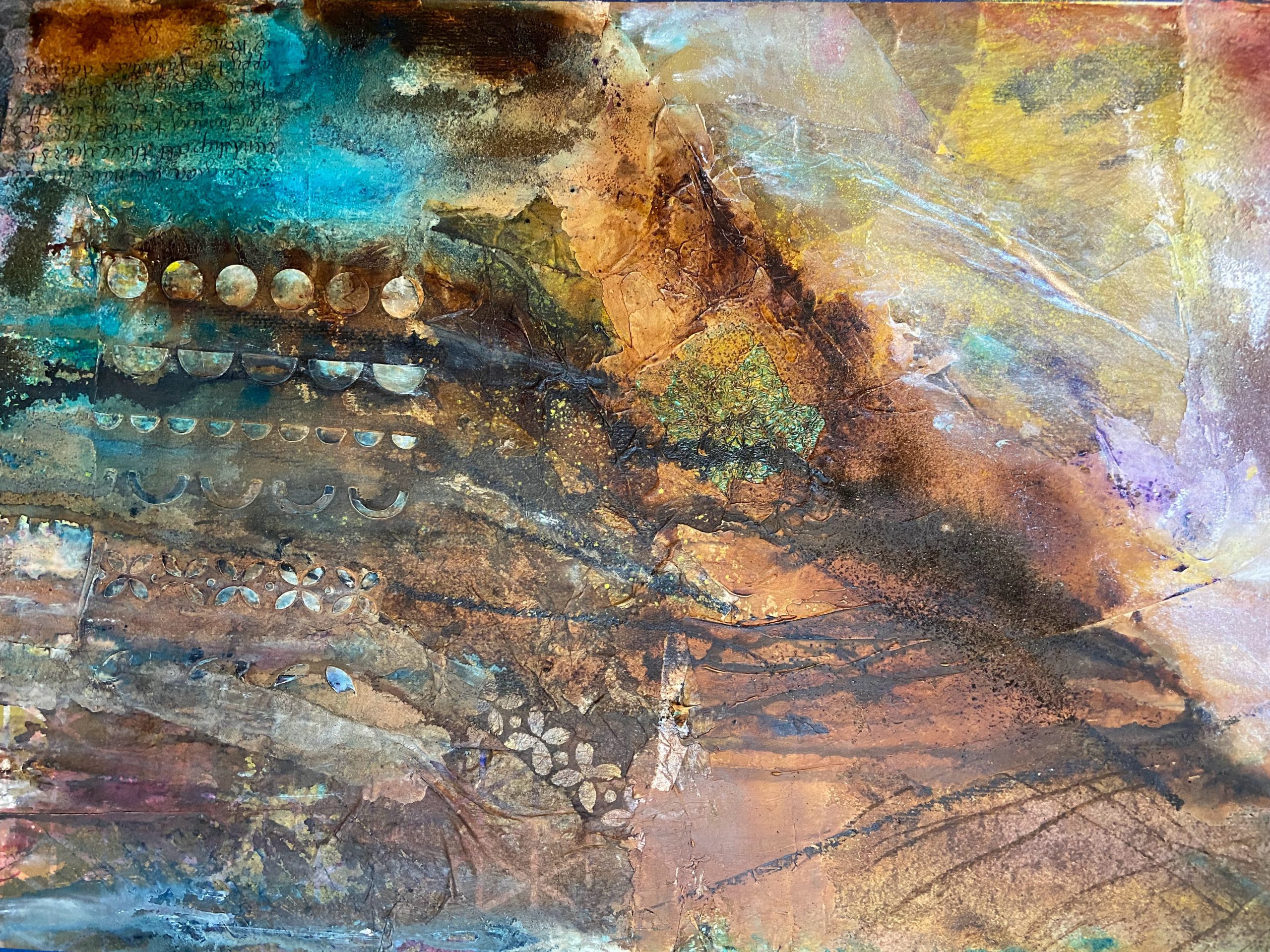
After my initial efforts, I watched the lesson on composition and decided this was a major fail in terms of composition. It was bottom heavy and lacked the full range of values for a successful abstract. I did see a mountain scene emerging from the mess and decided to give it more “sky.”
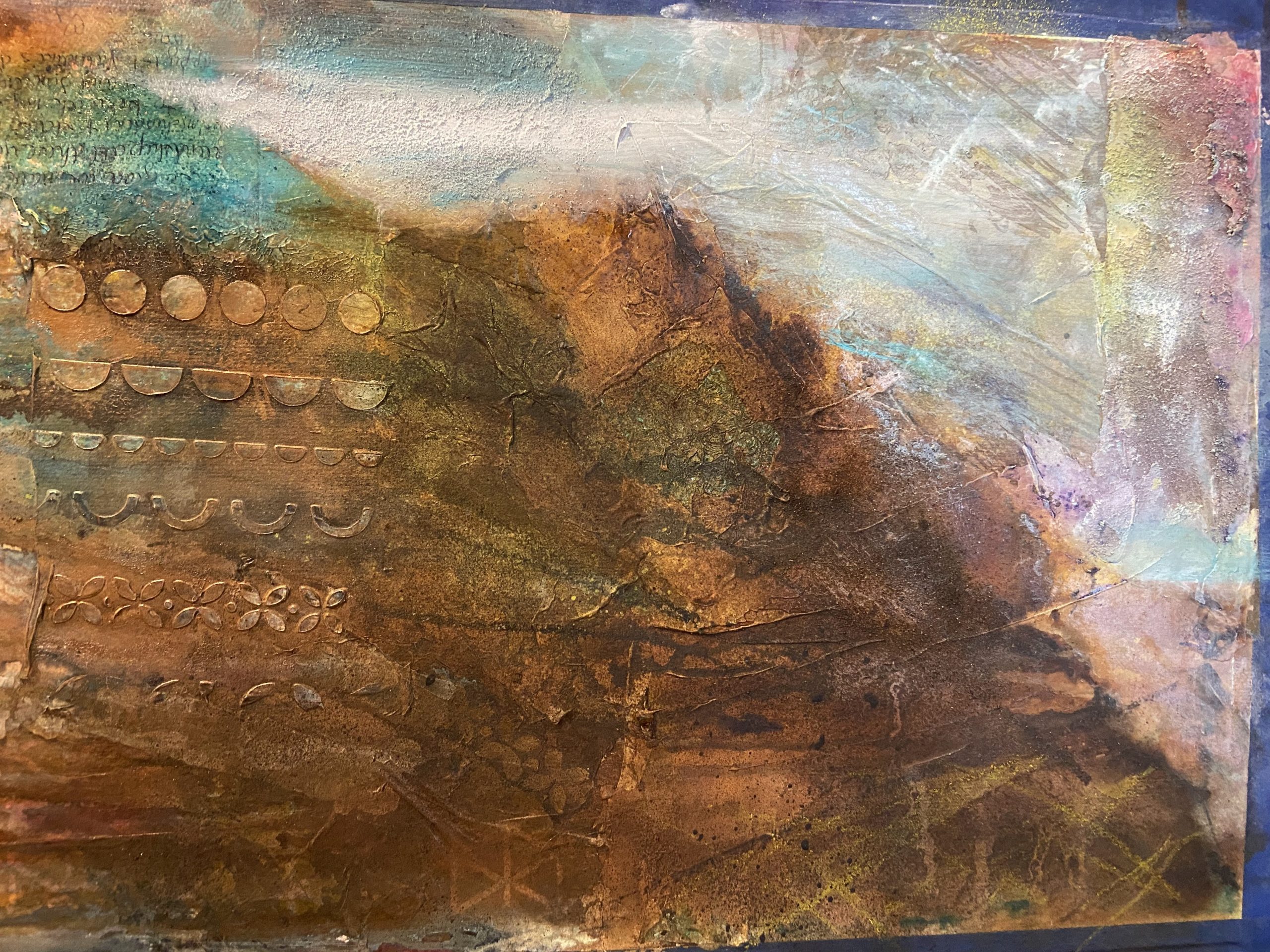
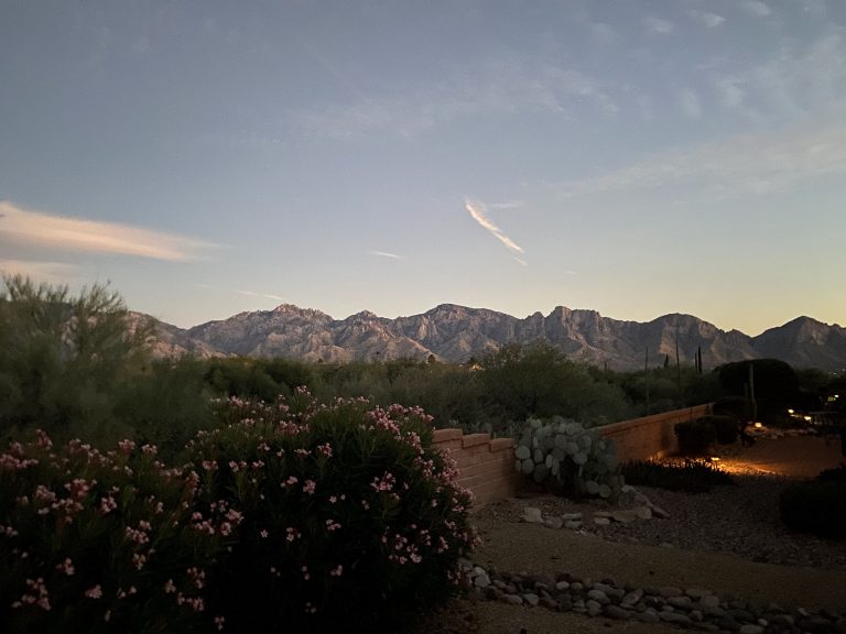
I was having trouble with a patch of texture paste running vertically along the right side. Since the overall painting reminded me of the red rock mountains in Arizona, I saw a “hoodoo” formation. I de ided to bring it into focus with the rock color.
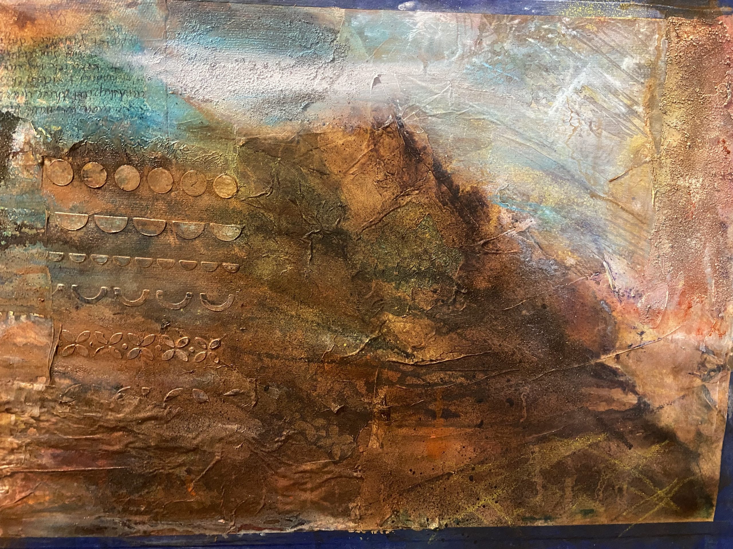
Something was still missing. . .
The Dream
I’ve been reading about lucid dreaming and how it can be used to foster creativity. Interestingly enough, I had what I’d consider a lucid dream about this time. Lucid dreaming occurs when you are aware you are dreaming and can even interact with the dream. The dream I had didn’t seem to have much to do with art, but the colors pink and hold played a role.
I decided this must be a sign and might be just what the painting needed. i scraped the colors across the painting along the bottom of the mountain form and the hoodoo formation.
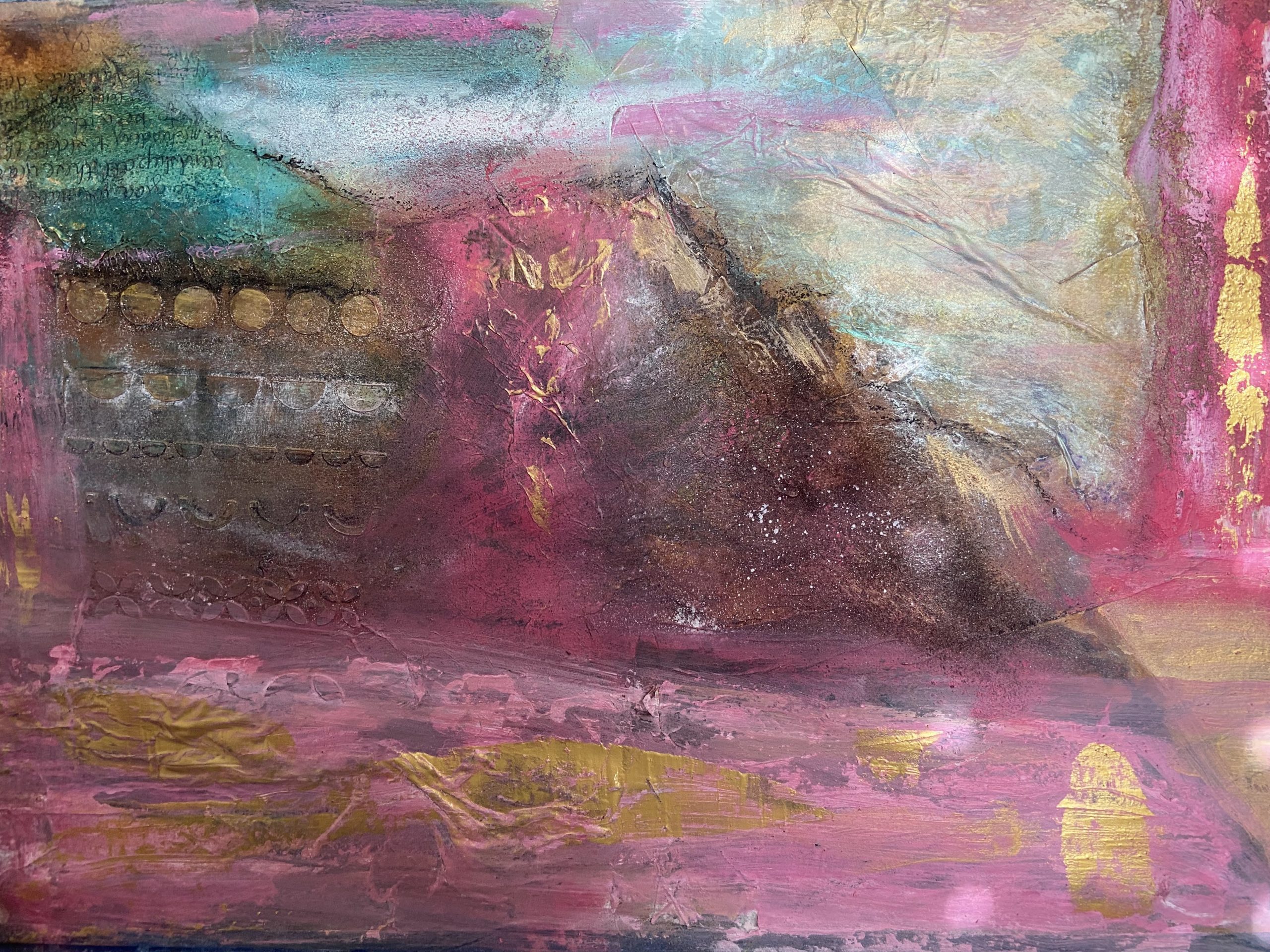
Ummm, maybe not what I was hoping for!
Takeaways
Abstract painting might not be my style. I like the concept of applying dreams to my paintings but was disappointed with how it turned out. I’m. Ot giving up on either at this point.
If you haven’t signed up for my newsletter, opt-in below and I will send you a digital self-confidence journal.