Happy Accidents in the Studio
Happy accidents happen! The sooner an artist can embrace their accidents, the sooner the artist will progress and find joy in whatever their art form. I share this to encourage anyone who has experienced making mistakes to work through them and sometimes the results were better than planned.
As part of the Kaleidoscope 2023 curriculum, the first sessions focus on color theory. I’ve always been one to skip through the fundamentals and dive right into the meat of the matter. I told myself to have the discipline to work through each color theory lesson. I didn’t always like the outcome, but learned more than I thought I would through the process.
The Color Wheel
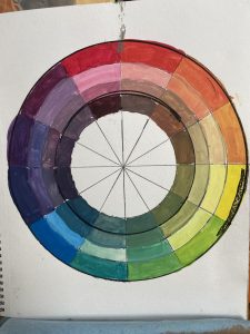
Tamara (Tam) LaPorte, the founder of Kaleidoscope, had us draw out and paint a color wheel. In this case, she used cooler versions of the primary colors of red, yellow, and blue. I used Primary Magenta, Cerulean Blue Hue, and Lemon Yellow. I was surprised how the cooler colors had such an effect on color mixing.
We then made tints (adding white), tones (adding grey), and shades (adding black) for each color. This whole process took several painstaking hours to complete.
My effort was sloppy, but I was okay with it and planned to clean it up by outlining the lines with a black acrylic marker. Oops! You can see the smears below. I decided to move on from this lesson.
Color Studies and Color Harmonies
Tam led us through several different color studies. We did every different color theory possible, even developing a new one she called “Tamadic” – her own version of triadic. We did monochromatic, analogous, complimentary, split complimentary, triadic, and more. Some I liked better than others. A tedious process, but again much learning involved.
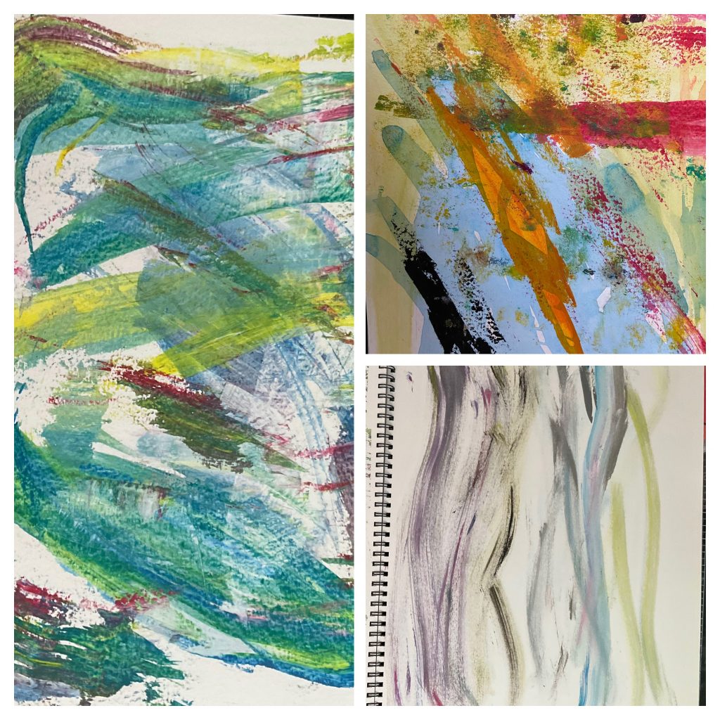
What To Do with All That Paint?
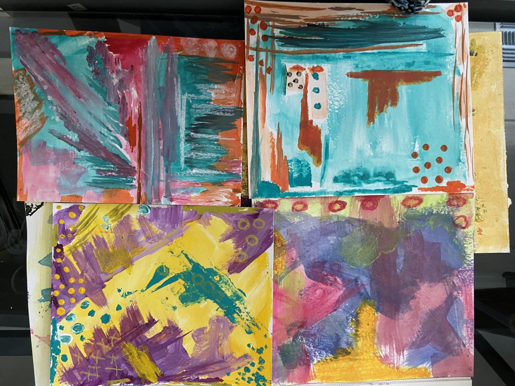
I tried to use as many of the same colors of paint in my color studies as to not waste the paint. In the end, I had way too much leftover paint. Frequently, I will take the leftover paint and use a credit card or some other tool to scrape the paint across a journal page to use as a background. Here are some examples from the leftover color mixing.
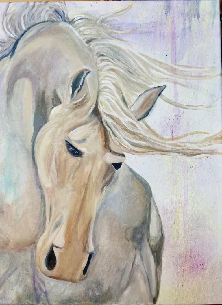
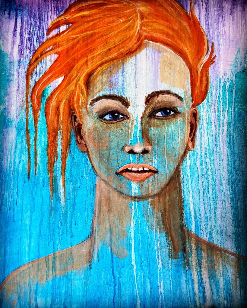
Another thing I like to do with leftover paint is spread it on a canvas, spray water, and see the happy accidents emerge. One such drippy canvas I did in the past, was the basis for my “Desire” painting shown below.
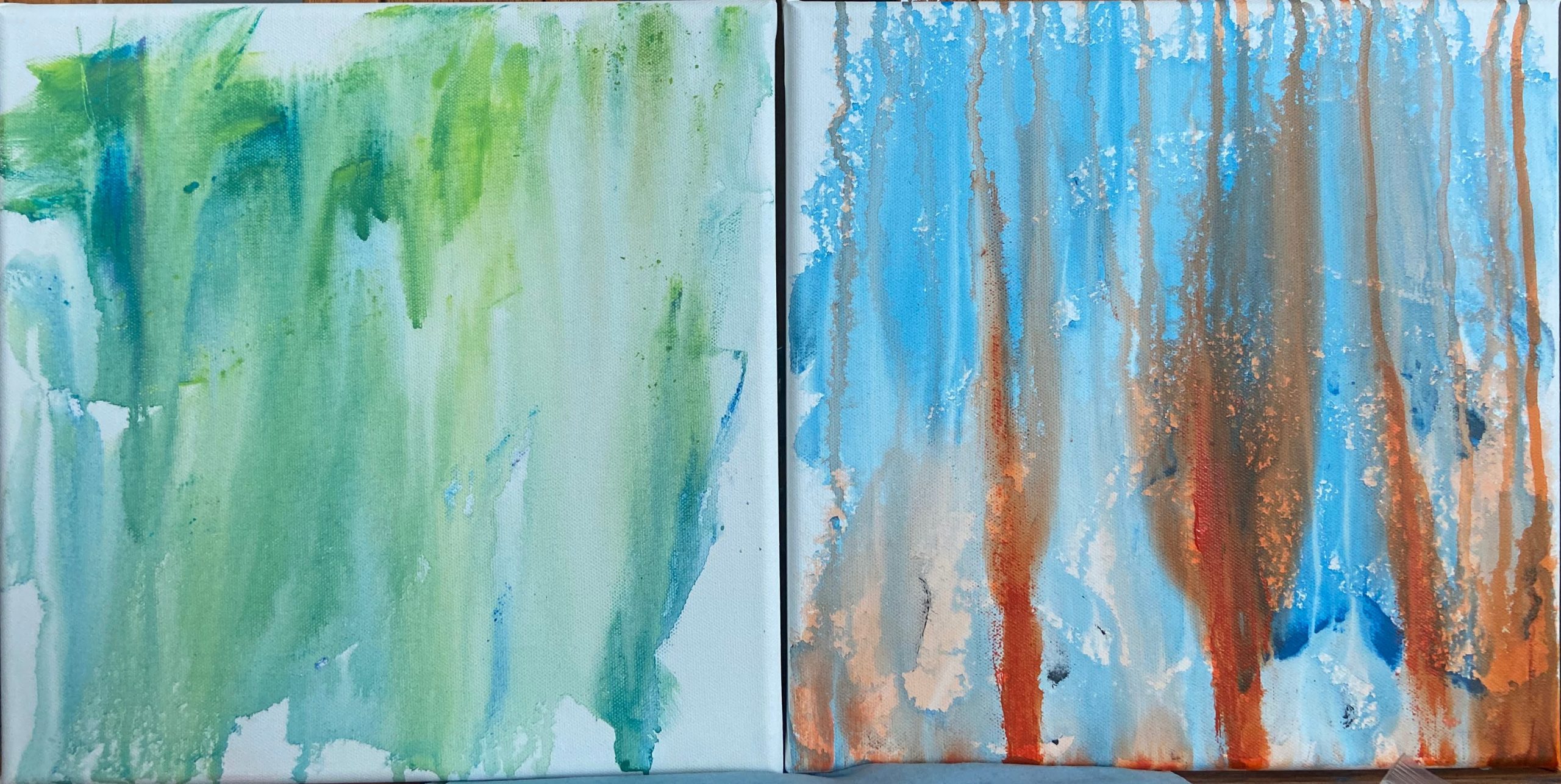
I used two color schemes in the leftover paints on the blank canvases shown below. One was an analogous theme (colors next to each other on the color wheel). You can see the results in the blues and greens on the canvas. The other one was a complimentary color scheme (colors opposite of each other on the color wheel). This one is done in orange and blue paint leftover from a color study.
Keep Your Paint Jars Closed!
Finally, I had been working on a separate project when I tipped over a full bottle of yellow acrylic paint! What a mess, but I had to do something with it. I had a drippy canvas readily available, so I put it facedown on the ink blob. The yellow ink turned a nice shade of green on the canvas. That was nice, but not enough.
I then dripped various colors of acrylic ink onto the canvas. I rather liked the result. I would say this is a version of a split complimentary color scheme. The original background was in shades of blue with complements of green and red (magenta). What do you think?

Accidents happen. How we react to them goes a long way to learning.
I hope you’re enjoying this journey through the Kaleidoscope 2023 course. I plan to keep posting my progress. Follow alng by joining below. Thank you for your interest.